Top 10 SaaS Landing Page Examples (2025)
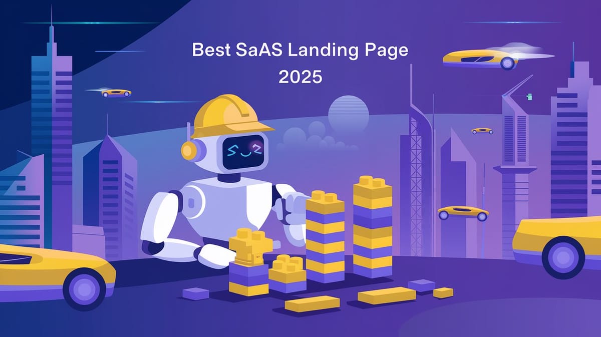
The design and functionality of a SaaS (Software-as-a-Service) landing page can significantly impact its ability to convert visitors into customers. In 2025, SaaS companies are leveraging innovative design trends, interactive elements, and customer-centric strategies to create high-converting landing pages. This report explores the top 10 SaaS landing page examples of 2025, highlighting their unique features, design principles, and conversion strategies. The examples provided are based on insights from trusted sources and industry trends.
You can also visit Oncely.com to find more Top Trending AI Tools. Oncely partners with software developers and companies to present exclusive deals on their products. One unique aspect of Oncely is its “Lifetime Access” feature, where customers can purchase a product once and gain ongoing access to it without any recurring fees. Oncely also provides a 60-day money-back guarantee on most purchases, allowing customers to try out the products and services risk-free.
Oncely is hunting for the most fantastic AI & Software lifetime deals like the ones below or their alternatives:

1. Slack: Clear Communication for Collaboration
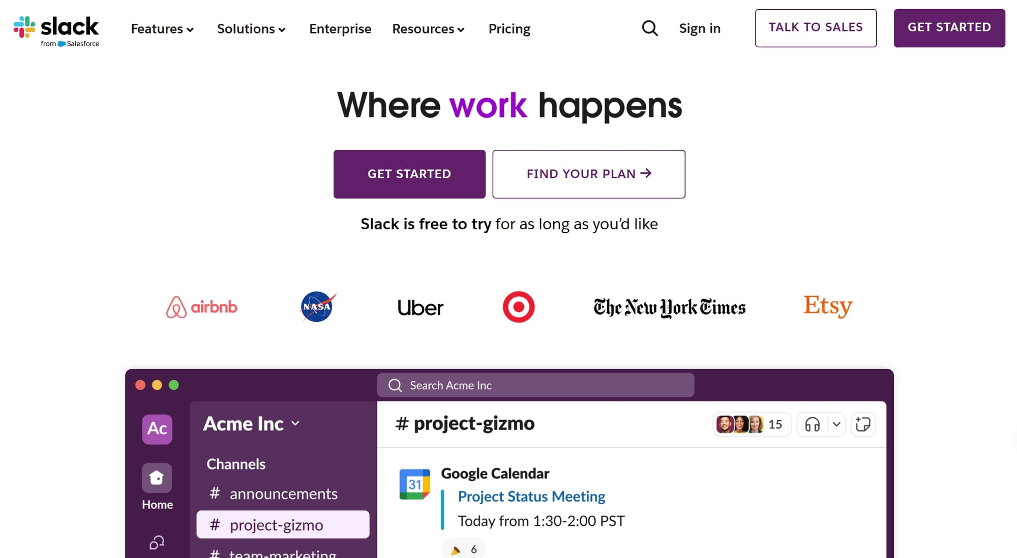
Slack's landing page continues to set the standard for SaaS design in 2025. Its primary focus is on clear communication and collaboration, which aligns perfectly with its product's purpose. The page uses social proof by showcasing team member pictures and testimonials, which builds trust and credibility among visitors. Additionally, the landing page features a clean layout with a strong call-to-action (CTA) that encourages users to "Get Started for Free."
Key Features:
- Social Proof: Includes team member photos and testimonials.
- Minimalist Design: Clean and uncluttered layout.
- Clear CTA: Encourages immediate action.
2. Asana: Visualizing Workflows
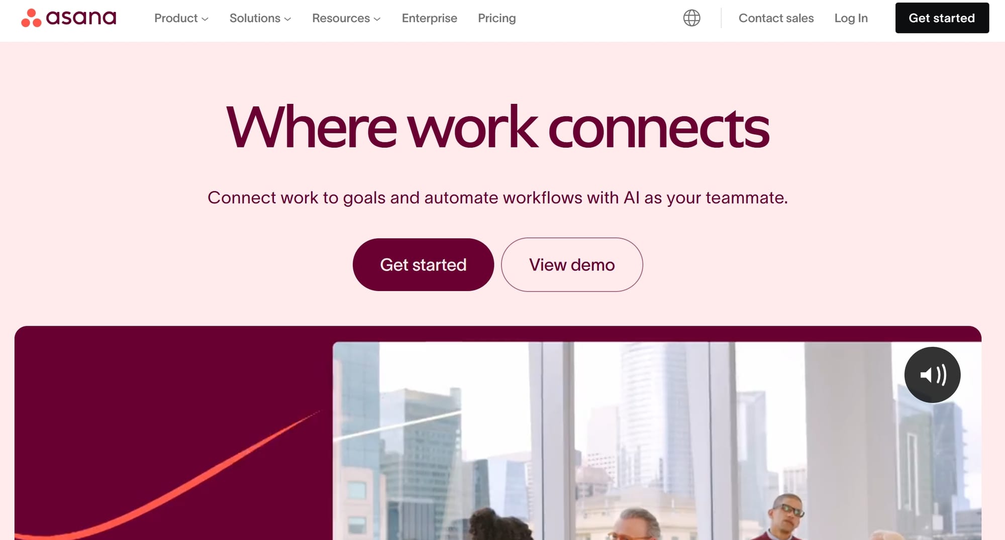
Asana’s landing page excels in visualizing workflows and simplifying project management. It uses a combination of interactive elements and engaging visuals to demonstrate how its platform works. The page also highlights its key features with short, digestible paragraphs and provides a seamless onboarding experience.
Key Features:
- Interactive Demos: Allows users to experience the product directly.
- Strong Visuals: Clear illustrations of workflows.
- Customer-Centric Design: Focuses on solving user pain points (Ad Labz, 2025).
3. Calendly: Effortless Scheduling
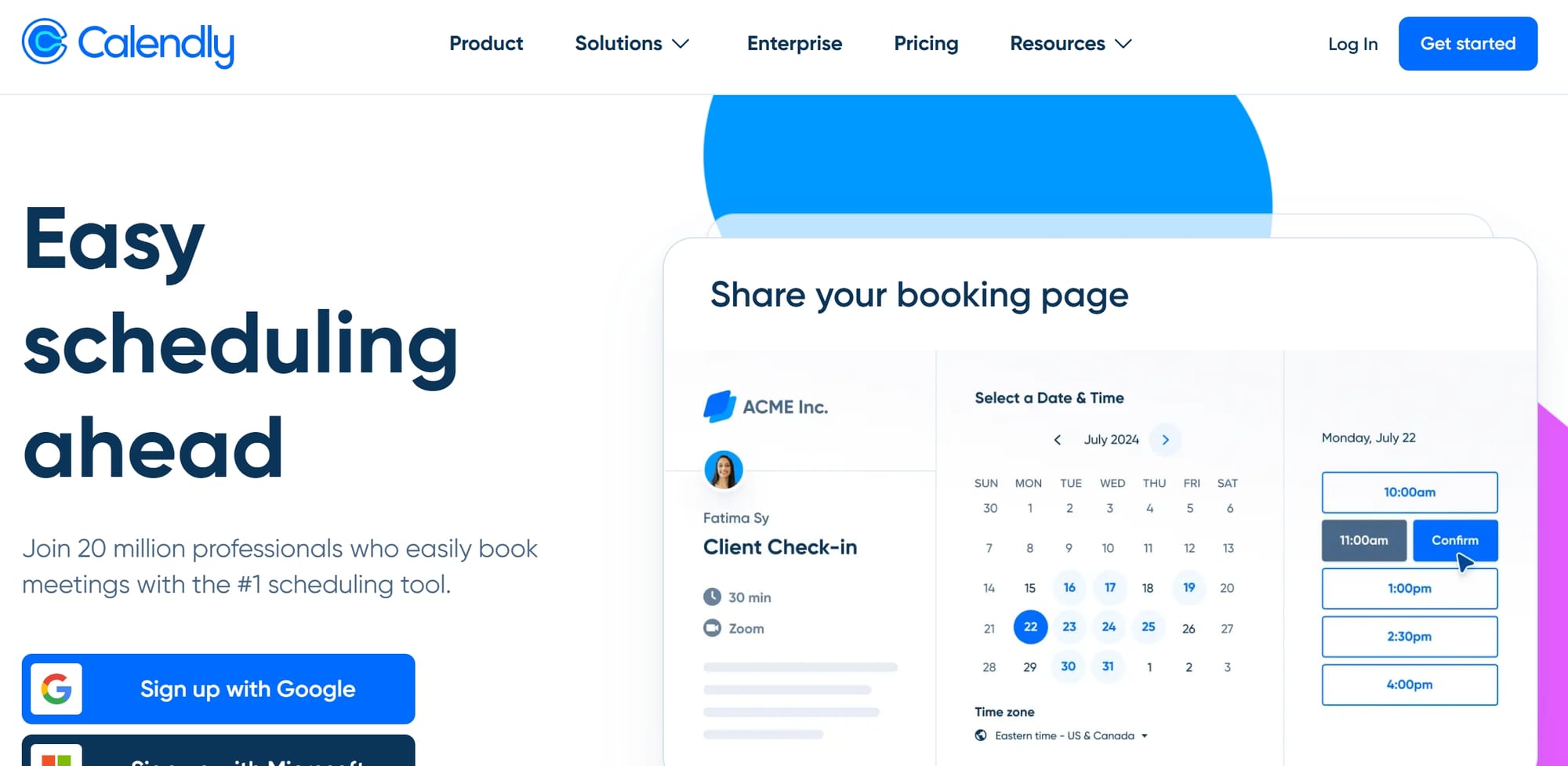
Calendly’s landing page emphasizes effortless scheduling with a simple, user-friendly design. The page features a hero section with a clear value proposition and a demonstration of how the platform integrates with other tools. Calendly also uses personalization to address different target audiences, such as individuals, teams, and enterprises.
Key Features:
- Hero Section: Highlights the product's value proposition.
- Integration Showcase: Demonstrates compatibility with other tools.
- Personalized Messaging: Tailored content for different user groups.
4. Notion: Flexible Workspaces
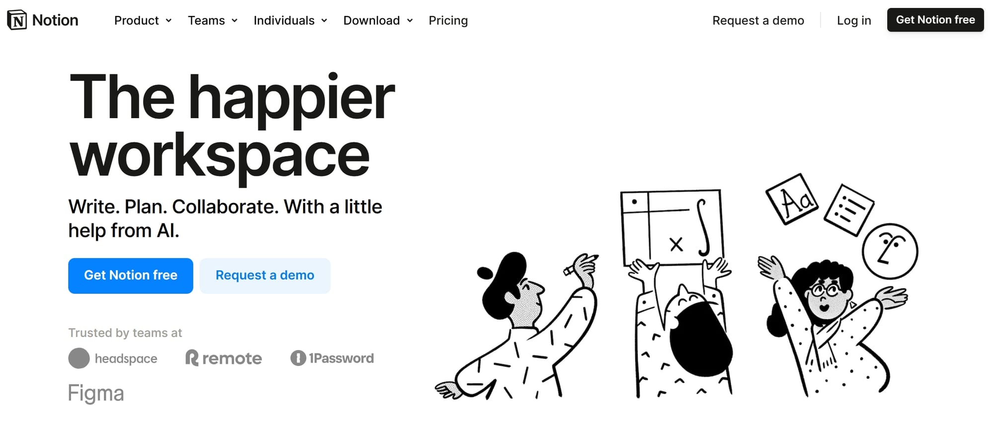
Notion’s landing page is a masterclass in showcasing flexibility and customization. The page uses video content to demonstrate its features, making it easy for users to visualize how the platform can adapt to their needs. Notion also incorporates testimonials and case studies to build trust and credibility.
Key Features:
- Video Content: Engages users with dynamic visuals.
- Testimonials: Builds trust through real user experiences.
- Customization Examples: Highlights the platform's adaptability.
5. Airtable: Database Functionality Simplified
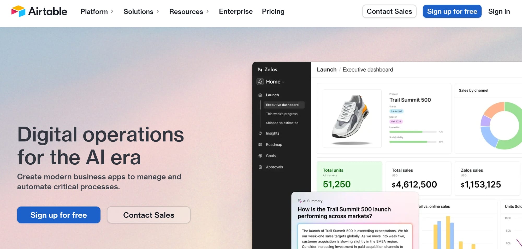
Airtable’s landing page focuses on simplifying database functionality for non-technical users. The page features live demos that allow users to interact with the product directly. Additionally, it includes a comparison chart that highlights its advantages over competitors, making it easier for potential customers to make informed decisions.
Key Features:
- Live Demos: Interactive elements to engage users.
- Comparison Chart: Clear differentiation from competitors.
- Engaging CTAs: Encourages users to start for free.
6. Trello: Organizing with Ease
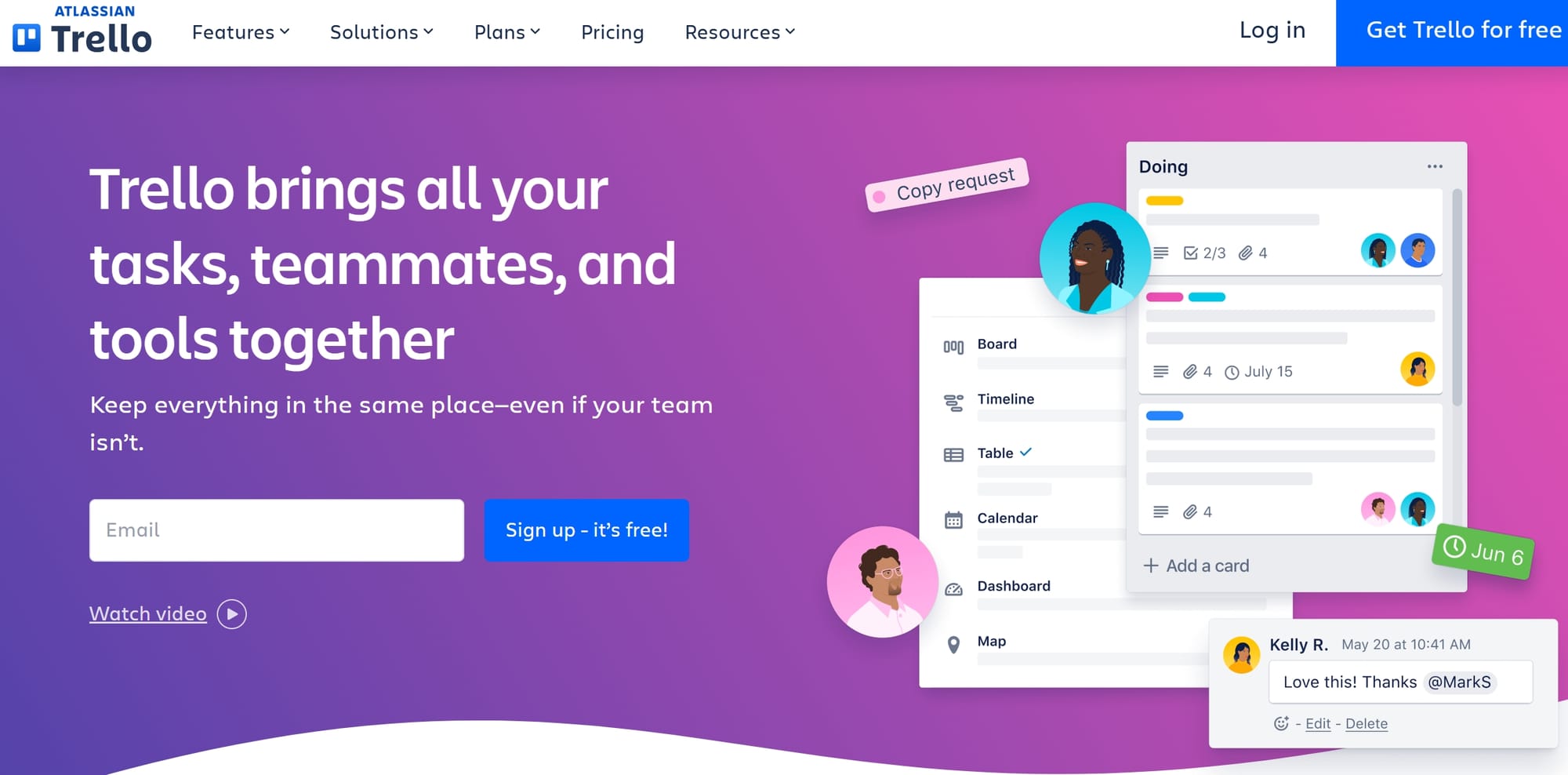
Trello’s landing page is designed to showcase its ease of use and organizational capabilities. The page features embedded live demos, allowing users to interact with the product without leaving the site. Trello also uses bright CTAs and engaging visuals to guide users through the page.
Key Features:
- Embedded Demos: Hands-on experience for users.
- Bright CTAs: Encourages action with visually appealing buttons.
- Simple Navigation: Easy-to-follow structure.
7. Dropbox: Secure File Storage
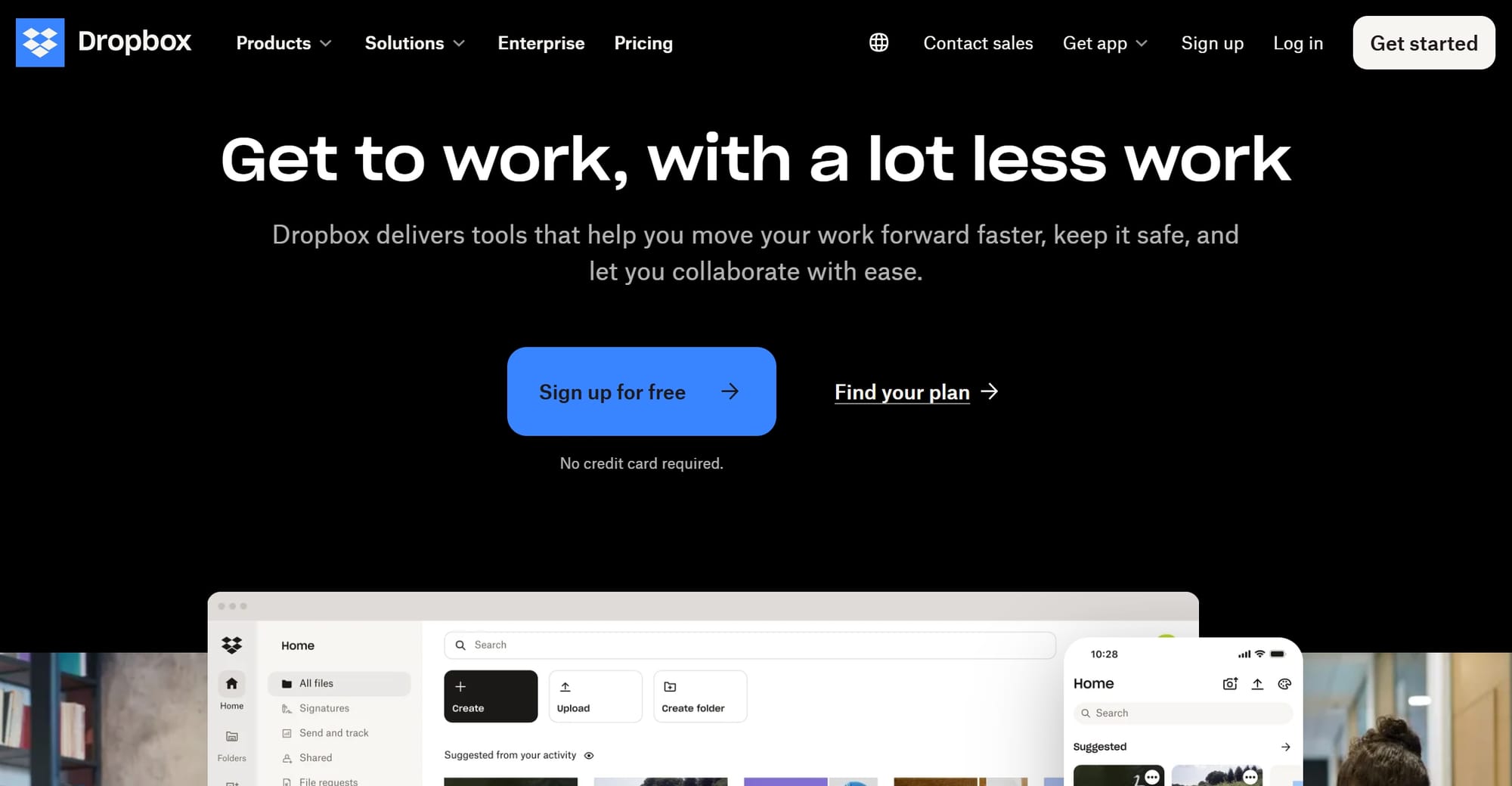
Dropbox’s landing page highlights its secure file storage capabilities with a focus on trust and reliability. The page includes security badges and compliance certifications to reassure users. Dropbox also uses testimonials and case studies to demonstrate its effectiveness in various industries.
Key Features:
- Security Badges: Builds trust with compliance certifications.
- Case Studies: Real-world examples of success.
- Simple Design: Focuses on clarity and ease of use.
8. Zendesk: Customer Relationship Management
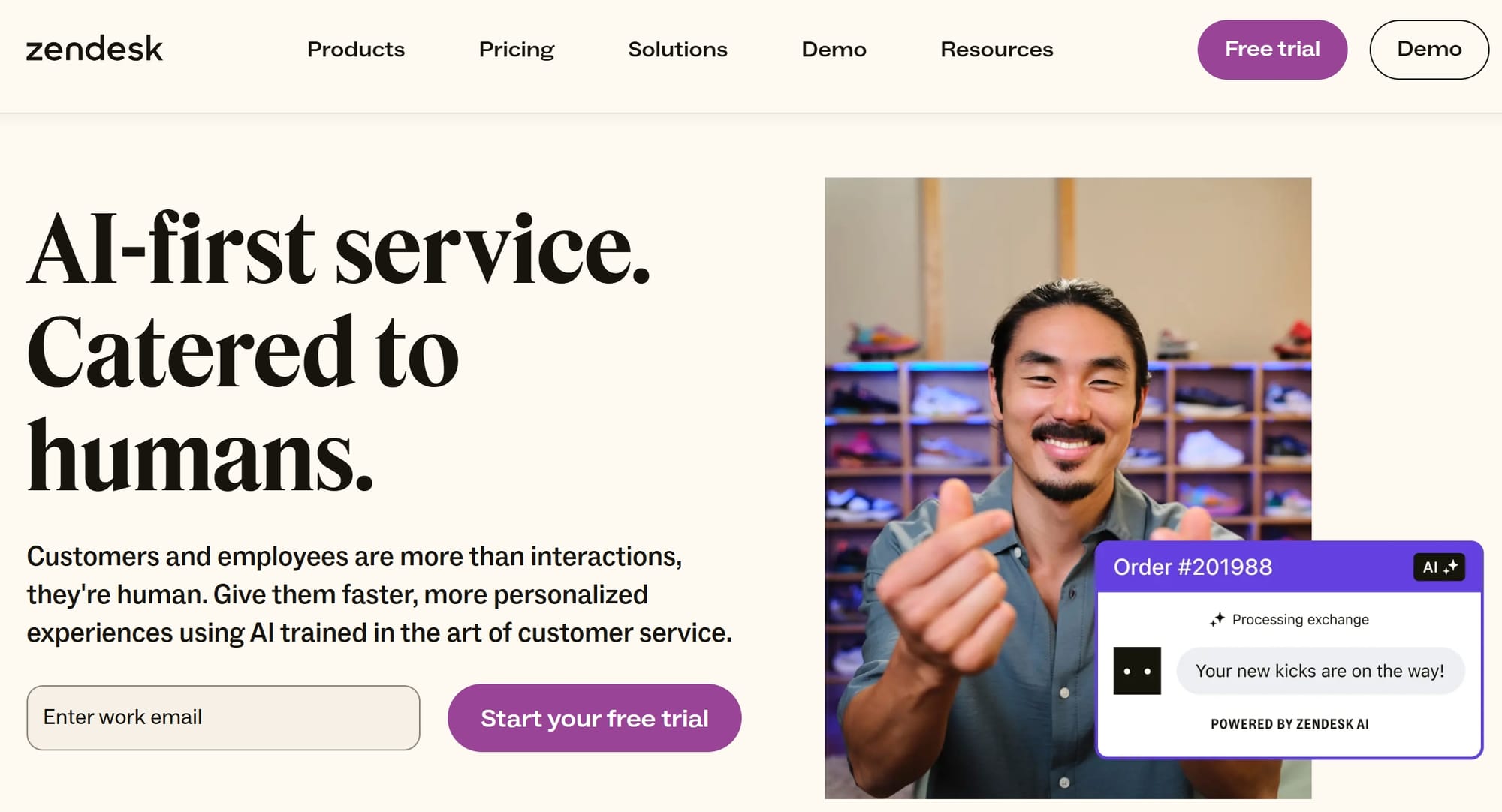
Zendesk’s landing page is tailored for customer relationship management. It uses gated content to collect email addresses, enhancing lead generation. The page also features explainer videos and interactive elements to engage users and showcase its features.
Key Features:
- Gated Content: Collects leads through demo videos.
- Explainer Videos: Simplifies complex features.
- Interactive Elements: Engages users with dynamic content.
9. HubSpot: Comprehensive Marketing Solutions
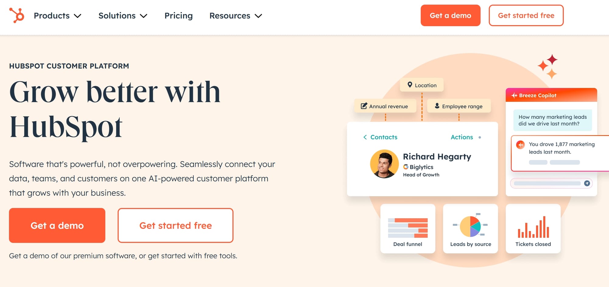
HubSpot’s landing page stands out for its comprehensive marketing solutions. The page uses engaging copy and persuasive CTAs to drive conversions. HubSpot also includes a resource hub with guides and tutorials, making it a valuable destination for marketers.
Key Features:
- Engaging Copy: Persuasive and action-oriented.
- Resource Hub: Provides additional value to visitors.
- Clear Pricing: Transparent and easy to understand.
10. Canva: Design Made Simple
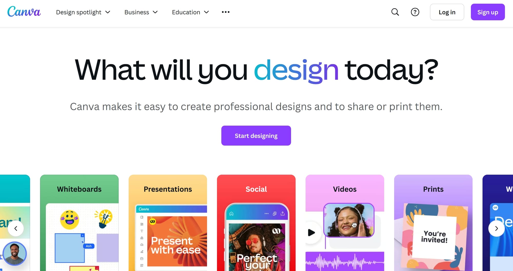
Canva’s landing page focuses on making design accessible to everyone. The page features a hero section with a clear value proposition and a short demo video that showcases its capabilities. Canva also uses social proof by displaying logos of well-known brands that use its platform.
Key Features:
- Hero Section: Highlights the product’s value.
- Demo Video: Engages users with dynamic content.
- Social Proof: Builds credibility with brand logos (HawkSEM, 2025).
Trends in SaaS Landing Page Design (2025)
1. Personalization
Personalized content is becoming increasingly prevalent. SaaS companies are tailoring their messaging to specific user segments, improving engagement and conversion rates.
2. Interactive Elements
Interactive features, such as live demos and explainer videos, are being used to engage users and provide a hands-on experience.
3. Social Proof
Testimonials, case studies, and brand logos are essential for building trust and credibility.
4. Clear CTAs
Bright and strategically placed CTAs are driving conversions by making it easy for users to take action.
Conclusion
The top SaaS landing pages of 2025 demonstrate the importance of user-centric design, engaging visuals, and clear messaging. By incorporating trends such as personalization, interactive elements, and social proof, these companies are setting the benchmark for high-converting landing pages. Whether you’re designing a new landing page or optimizing an existing one, these examples provide valuable insights and inspiration.
